Keep Your Logo Looking Sharp in Ads
You’ve invested time and money into a strong logo, so don’t let it get stretched, squished, or chopped in your ads.
It happens more often than you think: logos that don’t fit properly in Google Ads. Sometimes they’re too close to the edges, sometimes the shape doesn’t match the ad space. Either way, a misaligned logo can make even the best-designed ad look unprofessional.
Quick Tips for Clean, Professional Ads
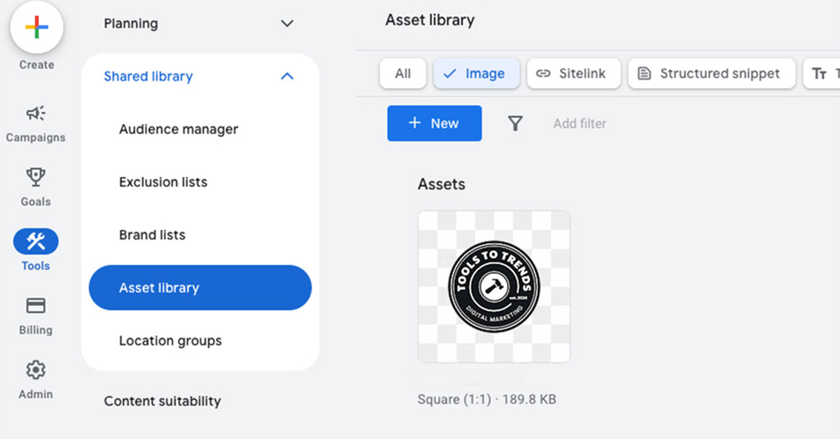
Choose the right size: 1200 x 1200 px for square logos, 1200 x 300 px for horizontal logos
Use a high-resolution PNG with a transparent background
Add padding around the logo to prevent it from being cut off in various ad formats
Small adjustments like these can have a big impact. Clean edges and proper spacing make your brand appear sharp, trustworthy, and professional.
Little Details Make a Big Difference
Whether you’re running ads for your own trade business or supporting local contractors, the details matter. A polished logo can be the difference between someone clicking on your ad or scrolling past.
Need help getting your visuals ad-ready? We can help. From logo sizing to full campaigns, we make sure trades and contractor businesses show up looking professional online.
FAQs
Why is my logo being cropped even when I use the recommended size?
Some ad placements automatically adjust images to fit their layout. Using Professional Google Ads guidelines like padding and proper sizing usually solves the problem
Can you help trades businesses get their logo ad-ready?
Absolutely. We specialize in helping trades and contractor businesses optimize logos for Professional Google Ads, websites, and other marketing channels
Do I need different versions of my logo for ads?
Yes. Consider creating a primary logo and a simplified version for smaller placements to ensure your brand is always visible and professional
Can you help with print materials as well?
Yes. We can make sure your logo looks great online and in print
Keep Your Logo Looking Professional
Your logo is the face of your business, and having it cropped in ads can cost credibility. With Professional Google Ads practices, the right sizes, padding, and previews, your brand will always look polished and trustworthy.
Ready to get your logo ad-ready? Contact us for a free logo audit and make sure your trades business is seen exactly as it should be.